JSON Form Builder and Form Library for Material UI
Add the SurveyJS drag-and-drop form builder and renderer to your MUI application and create dynamic forms from JSON. The SurveyJS MUI theme adapter makes both components follow your application’s colors, typography, shapes, and color scheme.
- MUI 7
- React
- JSON-based forms
- Backend-agnostic
See the Material UI Adapter in Action
Compare the same form built with SurveyJS and native MUI components to see how SurveyJS follows the active MUI theme.


How SurveyJS Themes Work
Components keep the same markup and CSS rules. Themes change the variable values those rules consume.
SurveyJS Component CSS
Design Tokens (--sjs2-*)
Theme Values
Rendered Components
How the Material UI Adapter Remaps SurveyJS Tokens
The adapter does not modify MUI or replace SurveyJS components. It makes SurveyJS variables resolve to host values.
Load the adapter after the SurveyJS base stylesheet. Its token mappings override the baseline SurveyJS theme values and connect them to the active MUI variables.
MUI Host Application
CSS variables generated from the active MUI theme:
- --mui-palette-primary-main: #1976d2
- --mui-palette-text-primary: rgba(0,0,0,0.87);
- --mui-palette-divider: rgba(0,0,0,0.12);
mui.min.css
Example token mappings:
- --sjs2-color-bg-brand-primary: var(--mui-palette-primary-main);
- --sjs2-color-fg-basic-primary: var(--mui-palette-text-primary);
- --sjs2-color-border-basic-secondary: var(--mui-palette-divider);
SurveyJS Components
Consume the values:

When Material UI Variables Change, SurveyJS Follows
When MUI changes the values of its CSS variables, the SurveyJS tokens that reference them resolve to the new values automatically. You do not need to rebuild the survey model or apply a separate SurveyJS color theme.
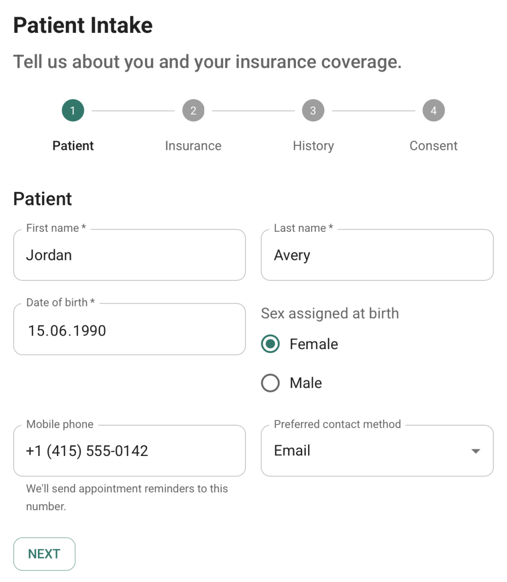
Light Mode
MUI Light
- --mui-palette-primary-main: #1976d2;
- --mui-palette-background-default: #ffffff;
- --mui-shape-borderRadius: 4px
mui.min.css
Adapter mapping.
- --sjs2-color-bg-brand-primary: var(--mui-palette-primary-main);
- --sjs2-color-bg-basic-primary: var(--mui-palette-background-default);
- --sjs2-radius-form: var(--mui-shape-borderRadius);
Dark Mode
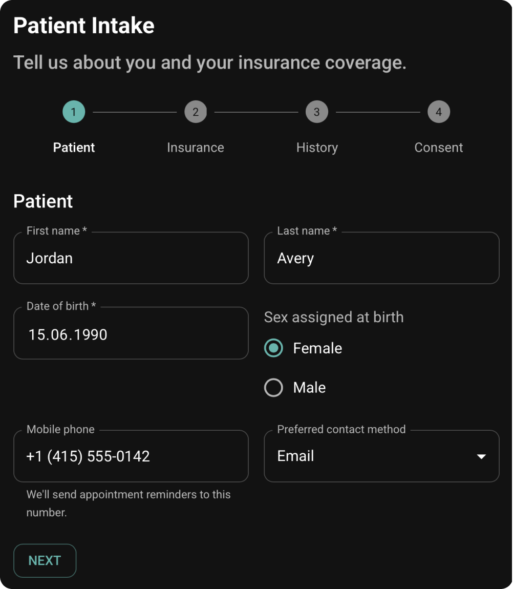
MUI Dark
- --mui-palette-primary-main: #90caf9;
- --mui-palette-background-default: #121212;
- --mui-shape-borderRadius: 4px
mui.min.css
Adapter mapping.
- --sjs2-color-bg-brand-primary: var(--mui-palette-primary-main);
- --sjs2-color-bg-basic-primary: var(--mui-palette-background-default);
- --sjs2-radius-form: var(--mui-shape-borderRadius);
Connect SurveyJS to Your Material UI Theme
Enable MUI CSS variables, provide the theme, and load the SurveyJS adapter after the base stylesheet.
Enable MUI CSS theme variables
The adapter reads values exposed as --mui-* custom properties.
import { createTheme } from "@mui/material/styles";

export const theme = createTheme({
  cssVariables: {
    colorSchemeSelector: "class"
  },
  colorSchemes: {
    light: true,
    dark: true
  },
  shape: {
    borderRadius: 10
  },
  typography: {
    fontFamily:
      "Roboto, system-ui, -apple-system, Segoe UI, sans-serif"
  }
});Provide the MUI theme
Render SurveyJS inside the same ThemeProvider as the rest of your application.
import CssBaseline from "@mui/material/CssBaseline";
import { ThemeProvider } from "@mui/material/styles";

<ThemeProvider theme={theme} defaultMode="light">
  <CssBaseline />
  <App />
</ThemeProvider>Load the adapter after SurveyJS base CSS
Later declarations remap SurveyJS tokens to the active MUI variables.
// For Form Library:
import "survey-core/survey-core.min.css";
import "survey-core/themes/adapters/mui.min.css";

// For Survey Creator:
import "survey-core/survey-core.min.css";
import "survey-creator-core/survey-creator-core.min.css";
import "survey-core/themes/adapters/mui.min.css";What the Adapter can Match Automatically
The adapter maps available MUI variables and supplies MUI-compatible styles where SurveyJS has no direct MUI counterpart.
| MUI theme area | What SurveyJS can inherit |
|---|---|
| Palette | Primary, background, surface, text, border, error, and state colors |
| Color schemes | Light and dark values exposed by the active MUI scheme |
| Typography | Mapped font family and MUI-compatible font sizes, weights, and line heights |
| Shape | Mapped border-radius values |
| Elevation | Mapped shadow values |
| Component states | Mapped hover, focus, disabled, and error styling |
Not Every MUI Decision Lives in the Theme
The adapter can read MUI CSS variables, but it cannot infer styling and layout decisions defined through MUI component composition, including sx props, Box, Stack, Grid, responsive breakpoints, custom variants, or proprietary components.
| Application decision | Why the adapter cannot infer it | What to do |
|---|---|---|
Box padding |
It is local to that component instance | Override the corresponding SurveyJS layout token |
Stack spacing |
It defines spacing between components in that particular layout | Map the spacing to SurveyJS vertical or horizontal gap tokens |
Responsive sx values |
They are application-level breakpoint rules | Add responsive SurveyJS overrides |
| Custom components and variants | They may have no standard MUI equivalent | Add token or targeted selector overrides |

Map MUI Composition to SurveyJS Layout Tokens
The host form uses local Box and Stack props. The override stylesheet mirrors those exact layout choices.
Host application
<Box sx={{ p: 2 }}>
  <Stack spacing={3}>
    <TextField label="Full name" />

    <Stack direction="row" spacing={2}>
      <TextField label="Department" />
      <TextField label="Role" />
    </Stack>
  </Stack>

  <Stack
    direction="row"
    spacing={1}
    sx={{ mt: 3 }}
  >
    <Button variant="contained">
      Continue
    </Button>
  </Stack>
</Box>
SurveyJS override
.sjs-theme-overrides {
  /* Box p: 2 → 16px */
  --sjs2-layout-component-survey-header-padding-horizontal: 16px;

  --sjs2-layout-component-survey-box-padding-bottom: 16px;

  /* Stack spacing={3} → 24px */
  --sjs2-layout-component-page-content-area-gap-vertical: 24px;

  /* Row spacing={2} → 16px */
  --sjs2-layout-component-page-content-area-gap-horizontal: 16px;

  /* Footer spacing={1} → 8px */
  --sjs2-layout-component-survey-footer-action-group-gap: 8px;
}Load Styles from General to Application-Specific
Your override stylesheet comes last, so its declarations win through normal CSS source order.
-
1
survey-core.min.css
Base SurveyJS component styles
-
2
survey-creator-core.min.css
Creator styles, when Creator is used
-
3
mui.min.css
Maps SurveyJS tokens to MUI variables
-
4
survey-overrides/mui.css
App-specific layout and component decisions
survey-overrides/<palette-id>.cssfor genuine palette-specific exceptions.
Use a Selector Only for Behavior Without a Token
Prefer --sjs2-* token overrides. They preserve SurveyJS’s styling architecture and remain easier to maintain.
Use a token first
Use a SurveyJS class selector only when the required application-specific behavior has no token equivalent.
Keep selectors narrow and document which host-app decision they reproduce.
.sd-progress-buttons {
  padding: 0 16px 16px;
}

.sd-root-modern--mobile
.sd-progress-buttons { padding-inline: 0; }When the Material UI Adapter is a Good Fit
The MUI adapter maps standard MUI theme variables and reproduces the appearance of supported stock MUI components. Application-specific layout rules, custom variants, and proprietary components require explicit overrides. As an application moves further away from standard MUI conventions, the adapter can automate less.
| Your MUI setup | Expected result | |
|---|---|---|
| Standard MUI theme with CSS variables enabled | Works directly | |
| Customized palette, typography, shape, or schemes exposed as --mui-* variables | Usually automatic | |
| Layout defined through Box, Stack, Grid, or responsive sx | Add small overrides | |
| Custom variants or styled() components | Review and map the differences | |
| Proprietary design system built on top of MUI | Use the SurveyJS styling skill and MCP server to help your AI coding agent analyze the app's design tokens and generate a CSS token mapping |


Render MUI-Styled Forms from JSON
Create dynamic forms with validation, conditional logic, calculated values, multi-page navigation, and repeatable sections. SurveyJS renders the schema while the adapter aligns the form with your MUI theme.
import { Model } from "survey-core";
import { Survey } from "survey-react-ui";
import CssBaseline from "@mui/material/CssBaseline";
import { ThemeProvider, createTheme } from "@mui/material/styles";
import "survey-core/survey-core.css";
import "survey-core/themes/adapters/mui.min.css";

const theme = createTheme({
  cssVariables: true
});

const surveyJson = {
  elements: [{
    name: "FirstName",
    title: "Enter your first name:",
    type: "text"
  }, {
    name: "LastName",
    title: "Enter your last name:",
    type: "text"
  }, {
    name: "PreferredContactMethod",
    title: "Preferred contact method",
    type: "radiogroup",
    choices: ["Email", "Phone"]
  }]
};

export function SurveyComponent() {
  const survey = new Model(surveyJson);
  return (
    <ThemeProvider theme={theme}>
      <CssBaseline />
      <Survey model={survey} />
    </ThemeProvider>
  );
}
Conditional Logic
Show, hide, enable, or require fields based on answers.
Multi-Page Forms
Break complex forms into steps with progress.
Dynamic Panels
Add, remove, and reorder repeatable groups.
Validation
Built-in validation and custom rules with clear error messages.
Localization
Translate content and validation into any language.
Read-Only Modes
Display submitted data or lock sections when needed.
Add a Drag-and-Drop Form Builder to Your MUI Application
Let business users create and update forms visually while your application retains control of schemas, responses, authentication, permissions, and storage.

- Embed Survey Creator
- Save JSON schema to your backend
- Use Form Library to render the schema
- Keep authentication and permissions in your app

Fits Your Application and Backend
SurveyJS runs as client-side libraries in the browser. Schemas and responses are plain JSON you send to your own API and store in your own database.
Browser
Themes + Components
Survey Creator (builder) + Form Library (renderer)


JSON
Your API
Your Database
-
Client-side libraries
Run entirely in the browser.
-
Store schemas and responses anywhere
Use your existing API and database.
-
No required hosted form service
Keep control, privacy, and compliance.

Frequently Asked Questions
Can I use SurveyJS with Material UI?
Can I use SurveyJS with Material UI?
Yes. Add SurveyJS Form Library or Survey Creator to your MUI application and import the SurveyJS MUI theme adapter. The adapter makes SurveyJS components use values from your active MUI theme so that they visually match the rest of the application.
Does SurveyJS render MUI components?
Does SurveyJS render MUI components?
No. SurveyJS renders its own components and does not replace them with MUI components. The adapter maps SurveyJS design tokens to MUI CSS variables so that SurveyJS components adopt the corresponding MUI colors, typography, shapes, and other theme values.
Does the adapter work with MUI 7?
Does the adapter work with MUI 7?
Yes. The SurveyJS MUI theme adapter works with MUI 7.
Do I need to enable MUI CSS theme variables?
Do I need to enable MUI CSS theme variables?
Yes. The adapter reads MUI theme values from --mui-* CSS custom properties, so your MUI theme must be configured to generate CSS variables. SurveyJS components must also be rendered inside the corresponding MUI ThemeProvider.
Can I use a customized MUI theme?
Can I use a customized MUI theme?
Yes, provided that your customized values are exposed as MUI CSS variables and have corresponding mappings in the adapter. Standard customizations to the palette, typography, shape, elevation, and color schemes can therefore be inherited automatically. Application-specific layout and component rules may require additional CSS.
Does it support custom MUI component variants?
Does it support custom MUI component variants?
Custom variants are not matched automatically unless their styling is exposed through CSS variables that the adapter can use. If a variant is implemented through component configuration, styled(), local selectors, or proprietary components, add an application-specific SurveyJS token or selector override.
What happens to styles defined with sx?
What happens to styles defined with sx?
Styles defined with sx apply to the MUI component on which they are declared. The adapter cannot inspect those declarations or infer layout decisions such as p: 2, spacing={3}, responsive values, or breakpoint-specific rules. To reproduce those decisions in SurveyJS, map the resolved values to the corresponding --sjs2-* layout tokens in an application-owned stylesheet.
Do I need custom CSS?
Do I need custom CSS?
Not when you use standard MUI theme values that are already covered by the adapter. You may need a small override stylesheet if your application defines layout through Box, Stack, Grid, responsive sx rules, custom variants, or proprietary components.
Prefer overriding --sjs2-* design tokens. Use SurveyJS class selectors only when the required behavior has no corresponding token.
Does Survey Creator generate MUI JSX?
Does Survey Creator generate MUI JSX?
No. Survey Creator produces and edits a JSON form schema, not MUI JSX or HTML markup. SurveyJS Form Library renders that schema at runtime, while the MUI adapter makes the rendered interface visually align with your MUI application.
Can Form Library and Survey Creator use the same MUI adapter?
Can Form Library and Survey Creator use the same MUI adapter?
Yes. Form Library and Survey Creator consume the same SurveyJS design-token system, so the same MUI adapter can style both products. Survey Creator does not require a separate MUI adapter.
Add Form Building to Your Material UI Application
Install SurveyJS, import the MUI adapter, and build dynamic forms that follow your application’s MUI theme.