Build Forms that Work Everywhere | How SurveyJS Ensures Responsive Form Design
Imagine this: you've invested hours crafting the perfect HTML form—a sleek signup form, a detailed feedback survey, or an insurance policy application. It looks great on your PC screen. But when a user opens it on their mobile device, chaos ensues. Fields spill off the screen, buttons are too small to tap, and the whole experience feels like a puzzle from the '90s. Frustrating, right?
That's the nightmare of non-responsive forms. But here's the good news: you don't have to live it. Responsive HTML forms just work on any device. And with SurveyJS, that magic is built in. Thanks to its no-code, drag-and-drop interface, you don't have to code your forms at all—let alone spend time making them responsive—SurveyJS ensures form responsiveness out-of-the-box.
Here in this article, we'll break down what responsive forms are and why they matter to your users, look at the key points of responsive HTML web design, and show how SurveyJS handles the heavy lifting so that every web form you create is responsive and works perfectly regardless of what device your respondent uses.
What Makes a Form Responsive
A responsive HTML form isn't just nice to have. It's a way to attract clients. Imagine a potential customer filling out your insurance quote while commuting. If the form is well-organized and buttons respond quickly to swipes, they are more likely to convert. Studies show that responsive sites boost engagement by up to 20% and cut bounce rates.
At its core, a responsive HTML form is one that automatically reshapes itself based on the user's device, screen size, and orientation—think desktops, tablets, or smartphones—without losing usability. It's not just about fitting the screen. It's about feeling native wherever it's viewed. This offers a seamless user experience without horizontal scrolling, tiny inputs, or awkward navigation on small screens.
The underlying idea is taken from Responsive Web Design, which uses fluid layouts to make content "look good on all devices" by dynamically resizing, hiding, shrinking, or expanding elements. When it comes to forms, this means input fields, labels, buttons, and validation messages reflow from multi-column grids on big screens to single-column stacks on phones, yet are accessible and usable. They're critical in today's web applications, given that more than 50% of web traffic originates from mobile browsers, and lack of responsiveness is known to cause high abandonment rates.
Key features include:
Viewport Meta Tag
<meta name="viewport" content="width=device-width, initial-scale=1">
This tag is essential for responsiveness. It tells the browser to use the device's actual width and scale the page content to 100% by default with initial-scale=1. Without this, mobile devices would show the page as a zoomed-out desktop view.
Media Queries
Media queries allow you to use different CSS rules to change the design when the screen width reaches specific values (breakpoints). This helps you adjust styles for various devices. For example, at @media (max-width: 600px), you might decrease font size or hide a sidebar to keep the form easy to read on small screens.
@media (max-width: 600px) {
  body {
    font-size: 16px; /* Reduces font size for readability */
  }
  .sidebar {
    display: none; /* Hides sidebar on small screens */
  }
}
Flexible Layouts
A flexible layout allows the form elements (input fields, labels, buttons) to automatically change their size, position, and alignment based on the screen size or container width. You can achieve a flexible layout using modern CSS techniques such as Flexbox or CSS grid layout. This is an important part of creating a responsive form.
Flexbox
Flexbox lets elements inside a container arrange themselves in rows or columns and wrap or size themselves based on the available space.
<div class="flex-container">
  <div class="item">1</div>
  <div class="item">2</div>
  <div class="item">3</div>
</div>

<style>
.flex-container {
  display: flex; /* Activate Flexbox layout */
  flex-wrap: wrap; /* Allow items to move to a new row if needed */
  gap: 10px; /* Add space between items */
}

.item {
  flex: 1 1 150px; /* Each item grows/shrinks and has a base width */
}
</style>
CSS Grid Layout
Grid offers more control over complex layouts, such as multi-column forms.
.form-grid {
  display: grid; /* Enables CSS grid layout */
  grid-template-columns: 200px 200px 200px; /* Adds three 200-pixel columns */
  gap: 10px;
}
Flexible Sizing and Units
Using relative units like %, em, rem, or vw/vh helps forms scale smoothly with screen size. Setting a button width to 80% instead of 300px ensures it looks good on both small phones and large monitors.
button {
  width: 80%;
  padding: 1em;
  font-size: 1rem;
}
Touch-Ready Design
Forms should be easy to use with fingers, not just a mouse. That means buttons and inputs should be large enough (at least 44px tall), fonts should be readable, and touch gestures should be supported.
The Usual Headaches and How to Avoid Them
Building responsive forms from scratch can feel like wrestling a hydra, with new problems appearing as soon as you solve one. You might face overflow nightmares from fixed-width tables or grids that force users to scroll sideways on their phones. Inputs that work fine with a mouse can turn into tiny, untappable targets on touchscreens. Fonts and paddings may expand or shrink unpredictably, throwing off the visual balance. And then there's the complex logic—showing or hiding fields based on screen size often means diving into a tangle of JavaScript.
Fortunately, the SurveyJS Form Library can help you overcome these challenges. You define your form in simple JSON using SurveyJS Survey Creator—no deep CSS dives needed—and the library renders form JSON responsively across devices. It uses a battle-tested CSS framework with Flexbox, custom variables for scalable spacing, and automatic class toggles for mobile. In short: you build once, it works everywhere.
How SurveyJS Nails Responsiveness
SurveyJS achieves responsiveness primarily through a modular CSS framework built on custom CSS properties (variables), Flexbox for flexible layouts, and media queries that target mobile devices (typically screens under 600px wide). The core CSS file (survey-core.min.css) defines a base theme with scalable units, which automatically adjusts paddings, margins, and font sizes across breakpoints. This creates a "mobile-first" adaptive system where desktop layouts (e.g., multi-column grids) collapse into single-column stacks on smaller screens to prevent horizontal scrolling and optimize touch interactions. Here's what it does under the hood.
Auto-Stacking Layouts
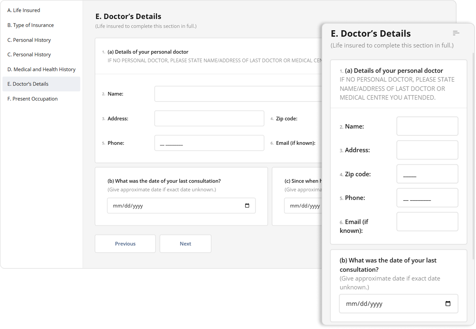
SurveyJS form elements use display: flex and grid-template-columns that switch from multi-column (e.g., 3-column grids) to single-column on mobile, with flex-wrap that prevents them from being squished into one row. In the example below, elements inside the doctor's details panel are arranged horizontally in three lines left to right, but wrap onto multiple lines and stack vertically when there isn't enough horizontal space.
Watch Video
Breakpoints
SurveyJS detects screens under 600px and applies mobile styles—reduces the font-weight, font-size, and line-height like so:
@media (max-width: 600px) {
  .v2-class---features-list-item__name--large {
    font-family: "Lato", sans-serif;
    font-style: normal;
    font-weight: 700;
    font-size: 24px;
    line-height: 36px;
  }
}
Table of Contents (TOC) Shrinks into a Floating Button
The TOC (enabled via showTOC: true in the survey JSON) appears as a fixed left sidebar with horizontal links, using position: sticky and overflow-y: auto for scrollable navigation.
However, on devices that don't offer enough space for the TOC to appear on the left-hand side, it automatically shrinks into a floating hamburger button that allow users to easily navigate form pages in one touch without having to use standard Previous/Next navigation.
Watch Video
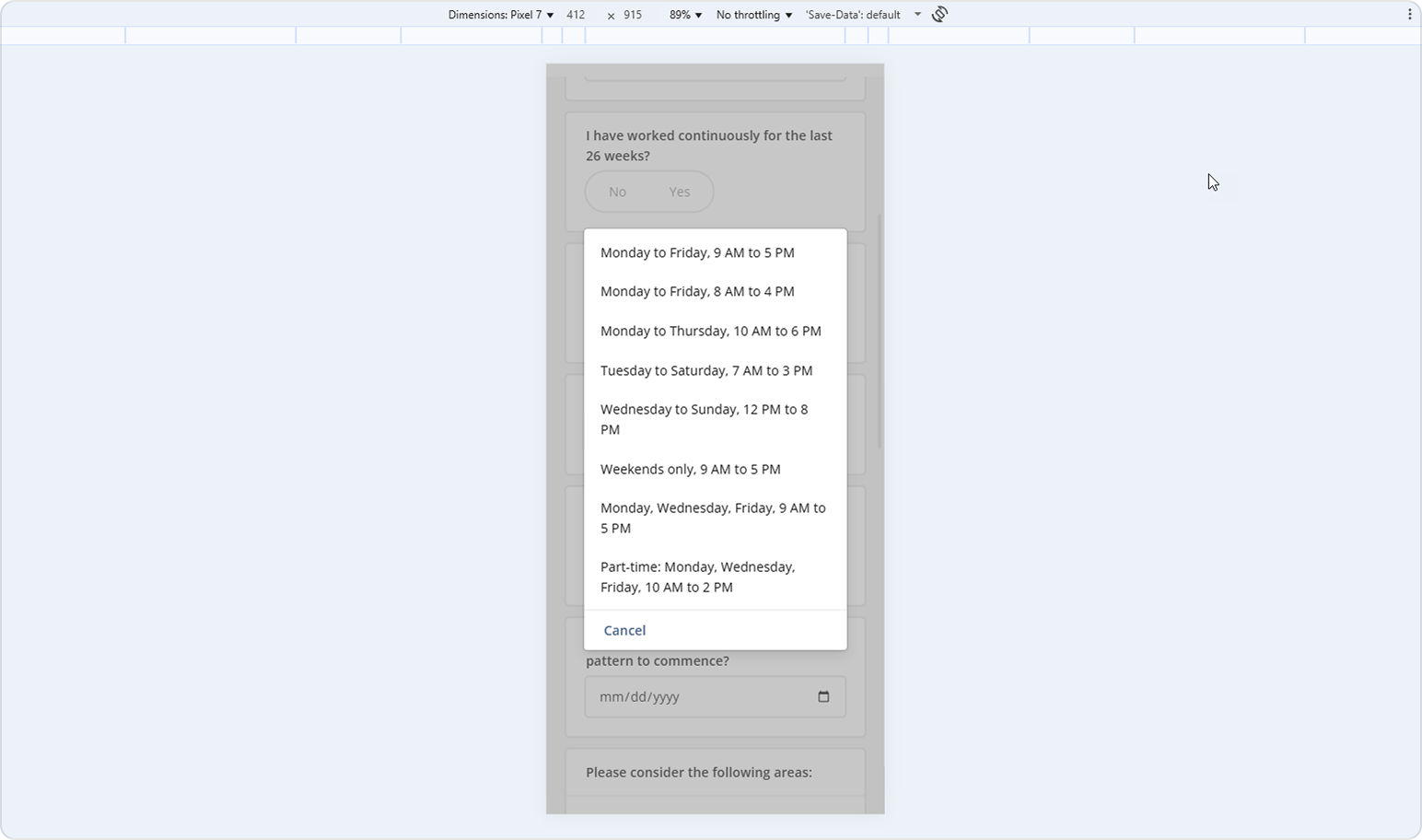
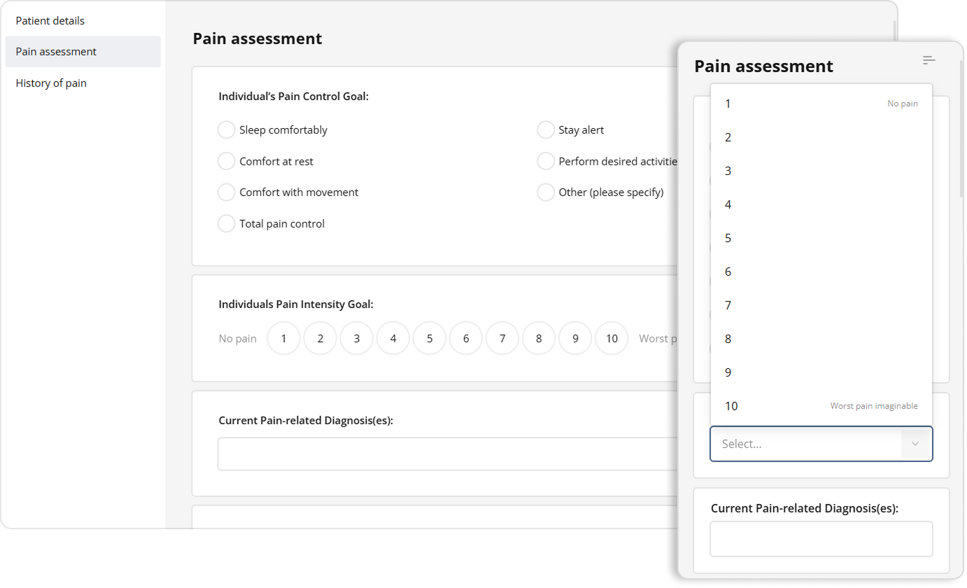
Input and Control Adjustments
On mobile devices, form elements automatically adapt for touch-friendly interaction:
All inputs and controls expand to full width (
width: 100%) with increased height for comfortable tapping.Dropdowns transform into overlay popups displaying vertical, scrollable lists for easier selection:
Rating questions become dropdowns to let users select their rating easily even on smaller screens:
Matrix questions reflow so that each column's content stacks vertically:
Watch Video
In general, these responsive capabilities ensure that SurveyJS forms are fully functional and good-looking on any device. SurveyJS does the responsive tweaking for you, so you can forget about layout issues and focus on building your questions and logic.