Themes & Styles
This help topic describes how to add SurveyJS UI themes to your Angular, Vue, React, jQuery, or Vanilla JS application, switch between them, or create a custom theme for your survey.
Add SurveyJS Themes to Your Application
SurveyJS Form Library is shipped with predefined UI themes illustrated below. Each theme supports dark mode and a more compact view without panels. These options give you a total of 40 different theme variations out of the box.
To use a theme, you need to reference a SurveyJS style sheet. Refer to the following sections of Get Started help topics for detailed instructions:
- Configure Styles in Angular
- Configure Styles in Vue
- Configure Styles in React
- Link SurveyJS Resources in an HTML/CSS/JavaScript Application
Apply a Predefined Theme
Predefined themes are distributed as JSON objects that specify CSS variables and other theme settings. You can find a full list of predefined themes and their variations on GitHub: survey-core/themes.
To apply a predefined theme in modular applications, import the theme object from its module and pass the object to SurveyModel's applyTheme(theme) method. The following code shows how to apply the Layered Dark Panelless theme:
import { Model } from "survey-core";
/*
  Don't forget to import or reference the `survey-core.css` style sheet
  as described in the Get Started with SurveyJS article for your framework
*/
import { LayeredDarkPanelless } from "survey-core/themes";

const surveyJson = { ... };
const survey = new Model(surveyJson);
survey.applyTheme(LayeredDarkPanelless);
In classic script applications, reference a theme script after the survey-core script and style sheet. Pass the theme object to the applyTheme(theme) method, as shown below:
<head>
    <!-- ... -->
    <link href="https://unpkg.com/survey-core/survey-core.min.css" type="text/css" rel="stylesheet">
    <script type="text/javascript" src="https://unpkg.com/survey-core/survey.core.min.js"></script>
    <script type="text/javascript" src="https://unpkg.com/survey-core/themes/layered-dark-panelless.min.js"></script>
    <!-- ... -->
</head>
const surveyJson = { ... };
const survey = new Survey.Model(surveyJson);
survey.applyTheme(SurveyTheme.LayeredDarkPanelless);
Switch Between Themes
If you want to add more than one SurveyJS theme to your application, import them or reference their scripts and call SurveyModel's applyTheme(theme) method to specify an active theme. For example, the following code imports the Contrast Dark and Contrast Light themes and applies the latter:
// In modular applications:
import { Model } from "survey-core";
import { ContrastDark } from "survey-core/themes";
import { ContrastLight } from "survey-core/themes";

const surveyJson = { ... };
const survey = new Model(surveyJson);
survey.applyTheme(ContrastLight);
<!-- In classic script applications: -->
<head>
    <!-- ... -->
    <link href="https://unpkg.com/survey-core/survey-core.min.css" type="text/css" rel="stylesheet">
    <script type="text/javascript" src="https://unpkg.com/survey-core/survey.core.min.js"></script>
    <script type="text/javascript" src="https://unpkg.com/survey-core/themes/contrast-dark.min.js"></script>
    <script type="text/javascript" src="https://unpkg.com/survey-core/themes/contrast-light.min.js"></script>
    <!-- ... -->
</head>
const surveyJson = { ... };
const survey = new Survey.Model(surveyJson);
survey.applyTheme(SurveyTheme.ContrastLight);
Create a Custom Theme
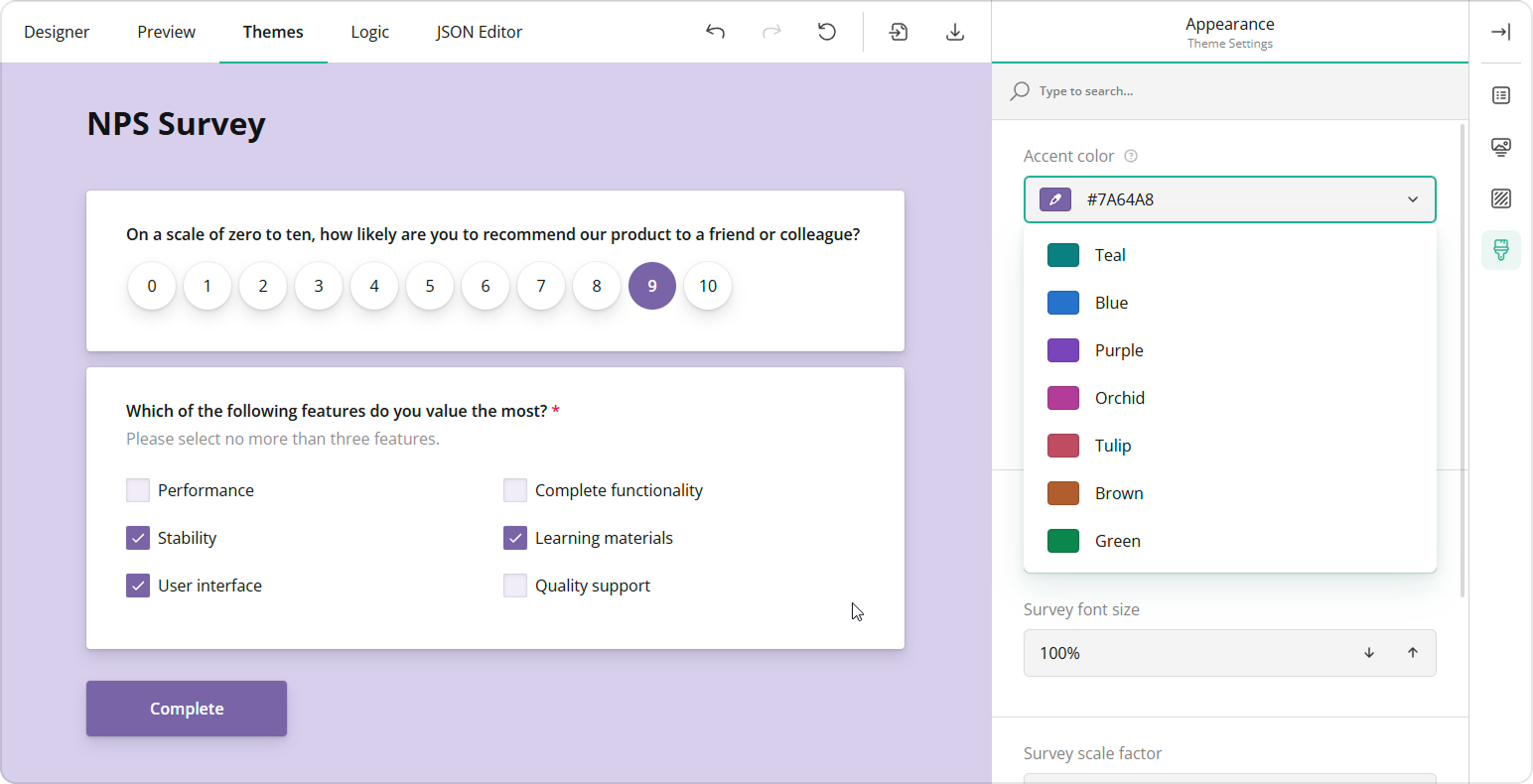
SurveyJS themes use CSS variables to specify colors, fonts, sizes, and other survey appearance settings. To create a custom theme, you need to change these variables. You can do this in Theme Editor—a UI theme designer with a user-friendly interface.

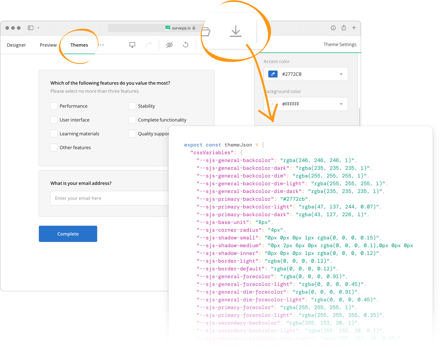
Theme Editor is integrated into Survey Creator. Open our all-in-one demo, switch to the Themes tab, and change theme settings using UI controls. Once you finish customization, click the Export button to download a JSON object with CSS variables and other theme settings:

To apply your custom theme, pass the downloaded JSON object to SurveyModel's applyTheme(theme) method:
import { Model } from "survey-core";
const surveyJson = { ... };
const survey = new Model(surveyJson);

survey.applyTheme({
  "cssVariables": {
      // ...
  },
  "themeName": "doubleborder",
  "colorPalette": "dark",
  "isPanelless": true
});
Apply Custom CSS Classes
You can apply individual custom CSS classes to all survey elements of a specific type. To do this, define a JavaScript object in which keys specify survey elements and values specify CSS classes. For information on the object structure, refer to the following file on GitHub: defaultCss.ts. Assign this object to SurveyModel's css property.
In addition, the SurveyModel object raises events that allow you to override CSS classes for individual questions, panels, pages, and choice items. Refer to the following event descriptions in the API reference for more information:
See Also
Send feedback to the SurveyJS team
Need help? Visit our support page