Toolbox Customization
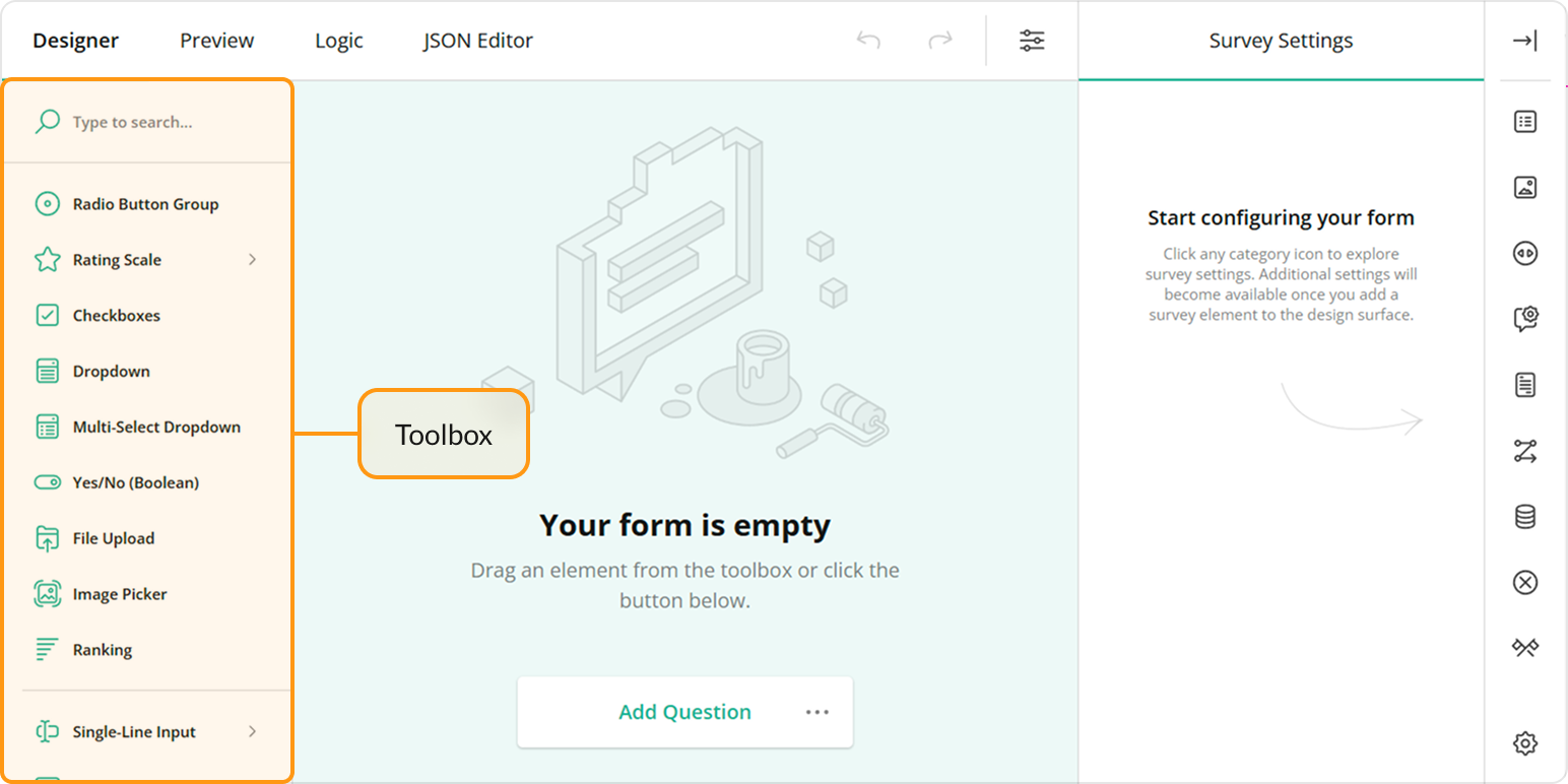
The Toolbox contains available question and panel types. Users can click questions and panels or drag and drop them onto the design surface to add them to the survey. This help topic describes how you can customize the Toolbox.

- Full and Compact Modes
- Limit Available Question and Panel Types
- Group Toolbox Items by Categories
- Customize Predefined Toolbox Items
- Manage Toolbox Subitems
- Add a Custom Toolbox Item
Full and Compact Modes
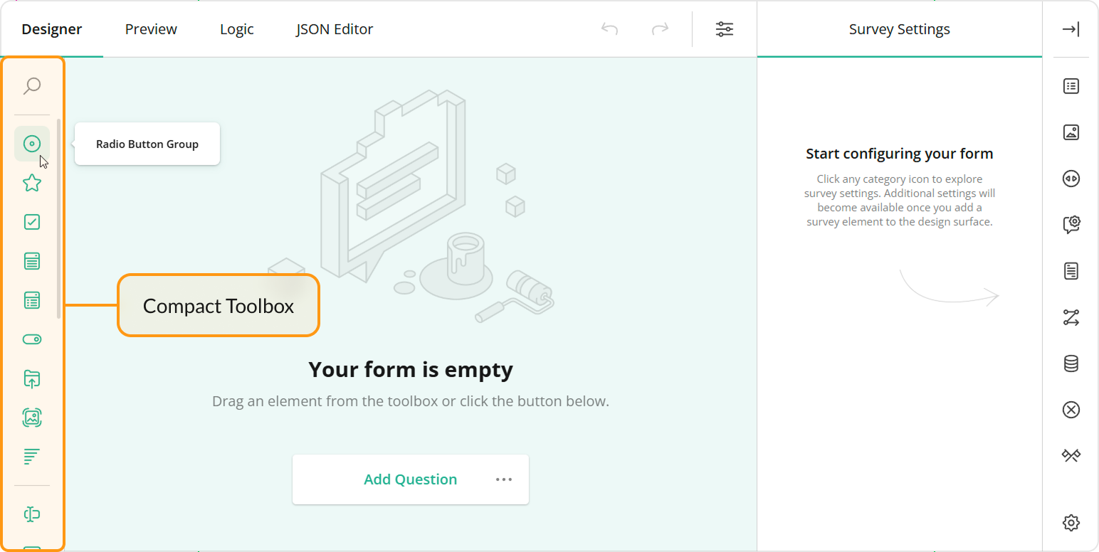
The Toolbox supports full mode (illustrated above) and compact mode. In compact mode, element names are hidden. To see an individual element name, a user should move the mouse pointer over the element icon.

The Toolbox switches between the modes automatically based on available width. Specify the forceCompact property if you want the Toolbox to always use a specific mode:
// Compact mode
creator.toolbox.forceCompact = true;
// Full mode
creator.toolbox.forceCompact = false;
You can also use the isCompact property to find out whether the Toolbox is currently in compact mode:
console.log(creator.toolbox.isCompact);
Limit Available Question and Panel Types
All available question and panel types are listed in the getType() method description. If you need to show only a part of these types, specify them in the Survey Creator's questionTypes array:
const creatorOptions = {
    questionTypes: ["text", "checkbox", "radiogroup", "dropdown"]
};

const creator = new SurveyCreator.SurveyCreator(creatorOptions);

// In React:
import { SurveyCreator } from "survey-creator-react";
const creator = new SurveyCreator(creatorOptions);
// In other modular applications:
import { SurveyCreatorModel } from "survey-creator-core";
const creator = new SurveyCreatorModel(creatorOptions);
Customize Predefined Toolbox Items
To customize a predefined Toolbox item, pass its type as an argument to the getItemByName(itemName) method. This method returns the item's configuration object. Change the properties of this object to customize the Toolbox item. For example, the following code uses the json property to override predefined choices for a Dropdown question:
creator.toolbox
  .getItemByName("dropdown")
  .json
  .choices = [
    { text: "Option 1", value: 1 },
    { text: "Option 2", value: 2 },
    { text: "Option 3", value: 3 }
  ];
Add a Custom Toolbox Item
You can add custom items to the toolbox in two ways:
Option 1: Create a Custom Question Type
The toolbox contains all question and panel types that can be added to a survey. To add a new toolbox item, define a new question type.
Choose this option if you need to:
- Define fixed question properties and prevent users from changing them
- Allow conversion to and from your custom type
- Encapsulate the internal logic of your question
- Extend or enhance the functionality of a built-in question
Refer to the following help topics for step-by-step instructions:
- Create Specialized Question Types
- Create Composite Question Types
- Integrate Third-Party Angular Components
- Integrate Third-Party React Components
- Integrate Third-Party Vue 3 Components
Option 2: Add a JSON Variation
Each toolbox item corresponds to a JSON object that gets added to the survey schema when a user drags the item onto the design surface. Built-in items map to distinct question and panel types, but you can also create toolbox items that represent specific configurations of those types.
JSON variations are useful for creating reusable templates without altering the functionality of the underlying questions. Keep in mind:
- JSON variations do not support type conversion
- Users can still change the property values defined in the JSON object
To add a JSON variation, call the addItem(item, index) method on a QuestionToolbox instance. For instance, the code below adds a "CSAT" toolbox item, which is a variation of a Rating Scale question:
creator.toolbox.addItem({
  name: "csat",
  title: "CSAT",
  json: {
    type: "rating",
    title: "Overall, how satisfied are you with our product?",
    rateType: "smileys",
    minRateDescription: "Dissatisfied",
    maxRateDescription: "Satisfied",
    minRate: 1,
    maxRate: 5
  }
});
JSON variations are conceptually similar to toolbox subitems since both represent specific configurations of existing question or panel types. Consider both approaches to determine which best fits your scenario.
Group Toolbox Items by Categories
The compact Toolbox does not display categories.
To organize toolbox items into categories, use the defineCategories(categories, displayMisc) method. This method accepts an array of objects as the categories parameter. Each object defines a single category and lists items included into it. Unlisted items can be collected in the Misc category if you pass true as the displayMisc parameter. Optionally, you can override display titles for individual items.
creator.toolbox.defineCategories([
  {
    category: "Choice-Based Questions",
    items: [
      "dropdown",
      "checkbox",
      "radiogroup",
      "tagbox",
      "imagepicker"
    ]
  },
  {
    category: "Text Input Questions",
    items: [
      "text",
      // Override the display title
      { name: "comment", title: "Multi-Line Input" },
      "multipletext"
    ]
  },
  {
    category: "Read-Only Elements",
    items: [
      "image",
      "html",
      // Override the display title
      { name: "expression", title: "Expression" }
    ]
  },
  {
    category: "Matrices",
    items: [
      "matrix",
      "matrixdropdown",
      "matrixdynamic"
    ]
  },
  {
    category: "Panels",
    items: [
      "panel",
      "paneldynamic"
    ]
  }
], true)
You can also use localization capabilities to change the caption of the Misc category. For example, the code below rename the Misc category to "Other Questions". Note that the code that changes the caption should go before the code that instantiates Survey Creator.
import "survey-creator-core/survey-creator-core.i18n";
import { getLocaleStrings } from "survey-creator-core";

// Rename the Misc category
const translations = getLocaleStrings("en");
translations.toolboxCategories["misc"] = "Other Questions";

// ...
// Instantiate Survey Creator here
//
To change the category of one or several toolbox items without redefining the entire toolbox structure, use the changeCategory(itemName, categoryName) or changeCategories(items) method. The following code places the Dynamic Panel and Dynamic Matrix toolbox items into a new "Dynamic Elements" category:
creator.toolbox.changeCategories([
  { name: "paneldynamic", category: "Dynamic Elements" },
  { name: "matrixdynamic", category: "Dynamic Elements" }
]);
Display Category Titles
Toolbox categories do not show their titles by default. Instead, the categories are separated one from another by a delimiter. If you want to display category titles, enable Toolbox's showCategoryTitles property.
creator.toolbox.showCategoryTitles = true;
Reorder Categories
Created categories are stored in the categories array of the Toolbox. You can access and modify this array if you want to reorder categories. For example, the following codes swaps the "Text Input Questions" and "Choice Questions" categories:
import { SurveyCreatorModel } from "survey-creator-core";

function swapItems(arr, index1, index2) {
  const item1 = arr[index1];
  arr[index1] = arr[index2];
  arr[index2] = item1;
}

const creator = new SurveyCreatorModel();

const categories = creator.toolbox.categories;
const choiceCatIndex = categories.findIndex(c => c.name === "choice");
const textCatIndex = categories.findIndex(c => c.name === "text");
swapItems(categories, choiceCatIndex, textCatIndex);
Control Category Behavior
The Toolbox also has the following properties to control the behavior of categories:
allowExpandMultipleCategories:boolean
Allows more than one category to be in an expanded state. If this property isfalse, when a user expands a category, other categories collapse. Default value:false.keepAllCategoriesExpanded:boolean
Expands all categories. Users cannot collapse them. This property applies only if the Toolbox displays category titles. Default value:false.
creator.toolbox.allowExpandMultipleCategories = true;
creator.toolbox.keepAllCategoriesExpanded = false;
Manage Toolbox Subitems
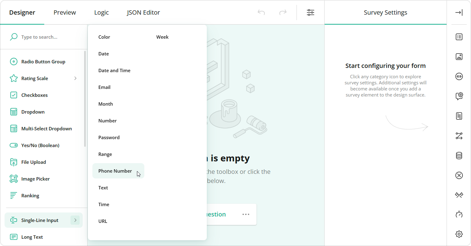
Toolbox items can have nested items, or "subitems". They appear when users hover over a toolbox item. Subitems help you create more specific configurations of a broader survey element type and group them. For example, the Single-Line Input toolbox item includes a number of subitems that create Single-Line Input questions with different inputType property values.

Create Subitems
To create a custom subitem, pass its configuration object to the addSubitem(subitem, index) method. Call this method on a toolbox item instance to which you want to add the subitem. For instance, the following code adds a "Limited to 280 characters" subitem to the Long Text toolbox item:
import { SurveyCreatorModel } from "survey-creator-core";
const creatorOptions = { ... };
const creator = new SurveyCreatorModel(creatorOptions);

const longTextItem = creator.toolbox.getItemByName("comment");
longTextItem.addSubitem({
    name: "limitedLongText",
    title: "Limited to 280 characters",
    json: {
        type: "comment",
        maxLength: 280
    }
});
Customize Subitems
To customize a subitem, access it by calling the getSubitem(name) method on a parent toolbox item instance. After that, you can change the subitem properties listed in the QuestionToolboxItem API Reference section. For example, the following code shows how to add an input mask to the Phone Number subitem that belongs to the Single-Line Input toolbox item:
const singleTextInputItem = creator.toolbox.getItemByName("text");
const telSubitem = singleTextInputItem.getSubitem("tel");
telSubitem.json["maskType"] = "pattern";
telSubitem.json["maskSettings"] = { "pattern": "+1(999)999-99-99" };
Remove Subitems
To remove a specific subitem, call the removeSubitem(subitem) method on a toolbox item instance. You can also remove all subitems of a toolbox item by calling the clearSubitems() method:
// Remove the Labels subitem of the Rating Scale toolbox item
const ratingScaleItem = creator.toolbox.getItemByName("rating");
ratingScaleItem.removeSubitem("labels");

// Remove all subitems of the Single-Line Input toolbox item
const singleLineInputItem = creator.toolbox.getItemByName("text");
singleLineInputItem.clearSubitems();
Toolbox subitems act like shortcuts for creating certain question configurations. Removing a subitem doesn't remove the associated properties from the Property Grid. If you need to prevent users from editing them, hide those properties explicitly.
You can completely deactivate the subitems feature by disabling the Toolbox's showSubitems property:
creator.toolbox.showSubitems = false;
Send feedback to the SurveyJS team
Need help? Visit our support page