How to Format User Input for Single-Line Fields
About Single-Line Fields
A single-line field is an input field where users can input text or data in a single horizontal line. These input fields are typically used for capturing short pieces of information, such as names, email addresses, phone numbers, or other text-based data. To ensure that users enter data in the correct format, you can specify the expected format or type of the input field. Each input type has specific behaviors and restrictions that affect how users interact with the field and what kind of data can be entered.
Types of Input
Color
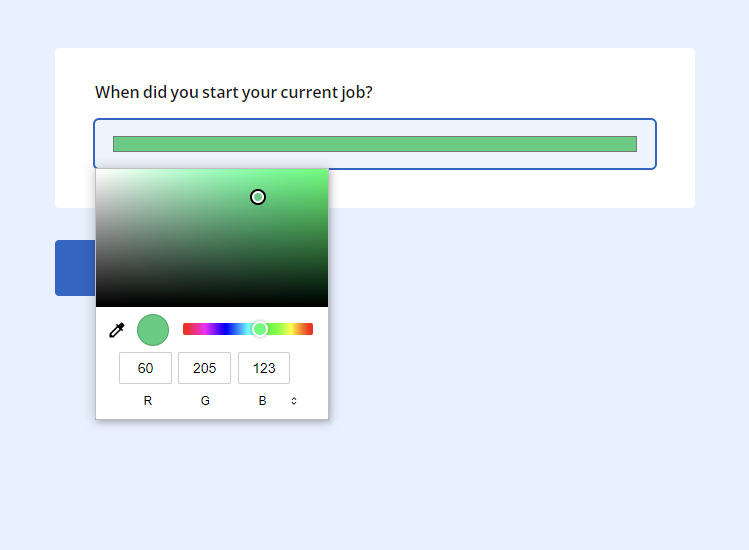
The Color input type allows users to select a color using a color picker or enter color code combination in HEX, RGB, or HLS format. Once a color is specified, its value is captured and submitted with the form data in one of the available formats. The image below illustrates a Single-Line Input question with an activated color picker.
Date
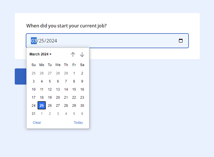
The Date input type enables users to select a date from a calendar widget. This type restricts input to a valid date format that depends on the browser's language (i.e., mm/dd/yyyy for English). Users can click on the input field to open a date picker and choose a date, as shown in the image below.
Datetime-local
Similar to the Date input type, Datetime-local allows users to select both date and time values. This type presents users with a combined date and time picker, allowing them to choose a specific date and time from a single input field.
The Email input type is used for fields that require email addresses. It ensures that the entered value follows the standard email format, containing an @ symbol and a domain name.
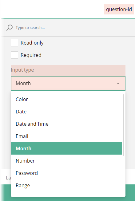
Month
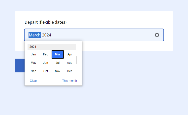
The Month input type allows users to select a month and year from a calendar with a scrollable interface. This type restricts input to a valid month year format, allowing users to specify a month without a specific day.
Number
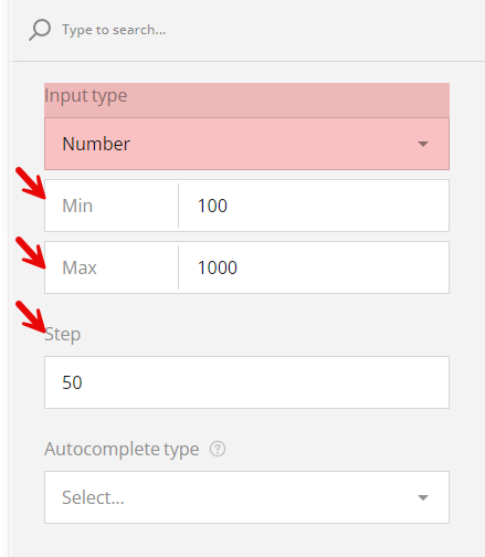
The Number input type restricts input to numeric values. It presents users with a spinner, allowing them to increment or decrement the value. This type also validates the input to ensure it is a valid numeric value. If you wish to enforce constraints on numeric input fields and provide guidance to users about acceptable input ranges and increments, you can also set the following values:
Min
Specifies the minimum value that the input field can accept. If a user tries to input a value lower than the specified minimum, the input will be considered invalid.Max
Specifies the maximum value that the input field can accept. If a user tries to input a value higher than the specified maximum, the input will be considered invalid.Step
Specifies the increment or decrement value for the input field. Users can increment or decrement the input value using the spinner control. The value entered by a user will be rounded to the nearest multiple of the step value.
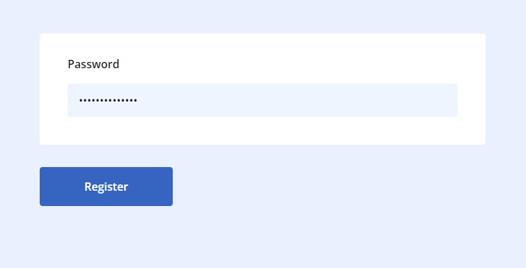
Password
The Password input type hides the characters entered by a user, making it suitable for fields with sensitive information, such as passwords or PINs. This input type provides security by obscuring the input characters to prevent them from being visible to others.
Range
The Range input type allows users to select a numeric value within a specified range by dragging a slider control. This type is often used for settings or preferences where users need to select a value from a continuous range, such as volume or brightness controls.
Phone Number
The Phone Number input type is used for fields that require telephone numbers. If you want to apply a specific phone number format, e.g. +1 (234) 555-12-34, you can use input masking instead.
Text
The Text input type is a generic input type used for single-line text fields. It accepts any text input from users, making it suitable for various purposes such as names, addresses, or short messages.
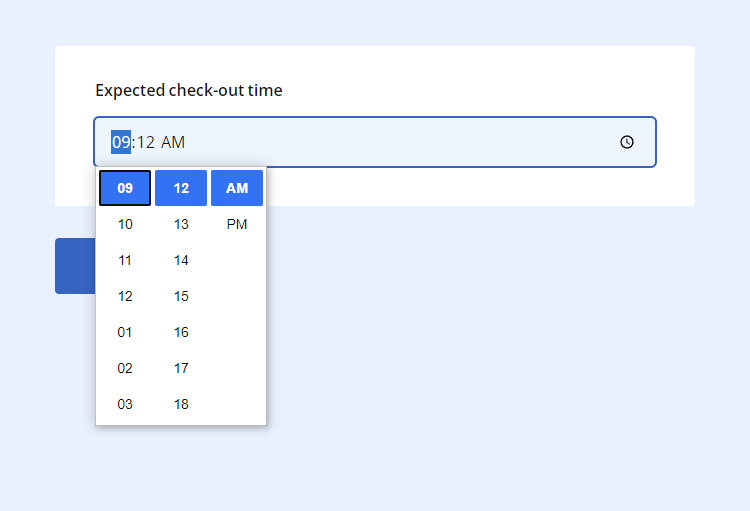
Time
The Time input type allows users to select a specific time using a time picker interface. This type restricts input to a valid time format, which depends on the browser's language (i.e., hh:mm AM/PM for English), and supports 12- and 24-hour time formats.
URL
The URL input type is used for fields that require website addresses or URLs. It validates the entered value to ensure it follows the standard URL format, including the protocol (http:// or https://) and domain name.
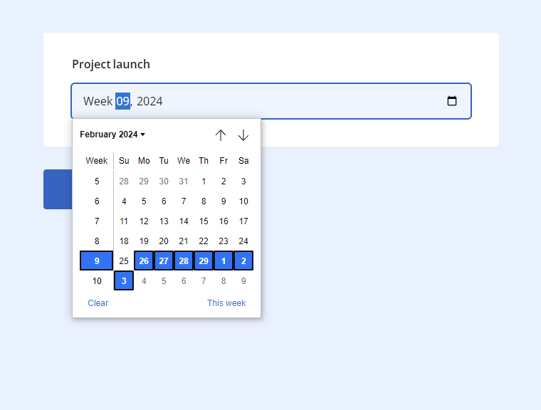
Week
The Week input type allows users to select a specific week from a calendar interface. This type restricts input to a valid week format Week ##, YYYY, where ## represents the week number within the year. Users can choose a week by clicking on the input field to open a week picker interface.
How to Set Input Type for Single-Line Fields
In SurveyJS Form Builder, you can set input type for single-line fields available in the following question types:
- Single-Line Input
- Multiple Textboxes
- Multi-Select Matrix (as a cell type)
- Dynamic Matrix (as a cell type)
Single-Line Input
By default, any Single-Line Input question added to a form has its input type set to Text.
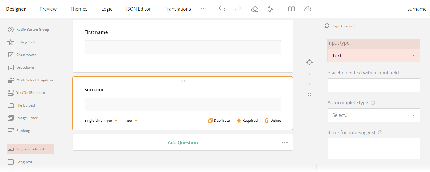
To change the input type for a Single-Line Input question, follow these steps:
Select a Single-Line Input question for which you wish to set a new input type.
Under General, locate the Input type property.
In the drop-down menu, select among the available input types.
Multiple Textboxes
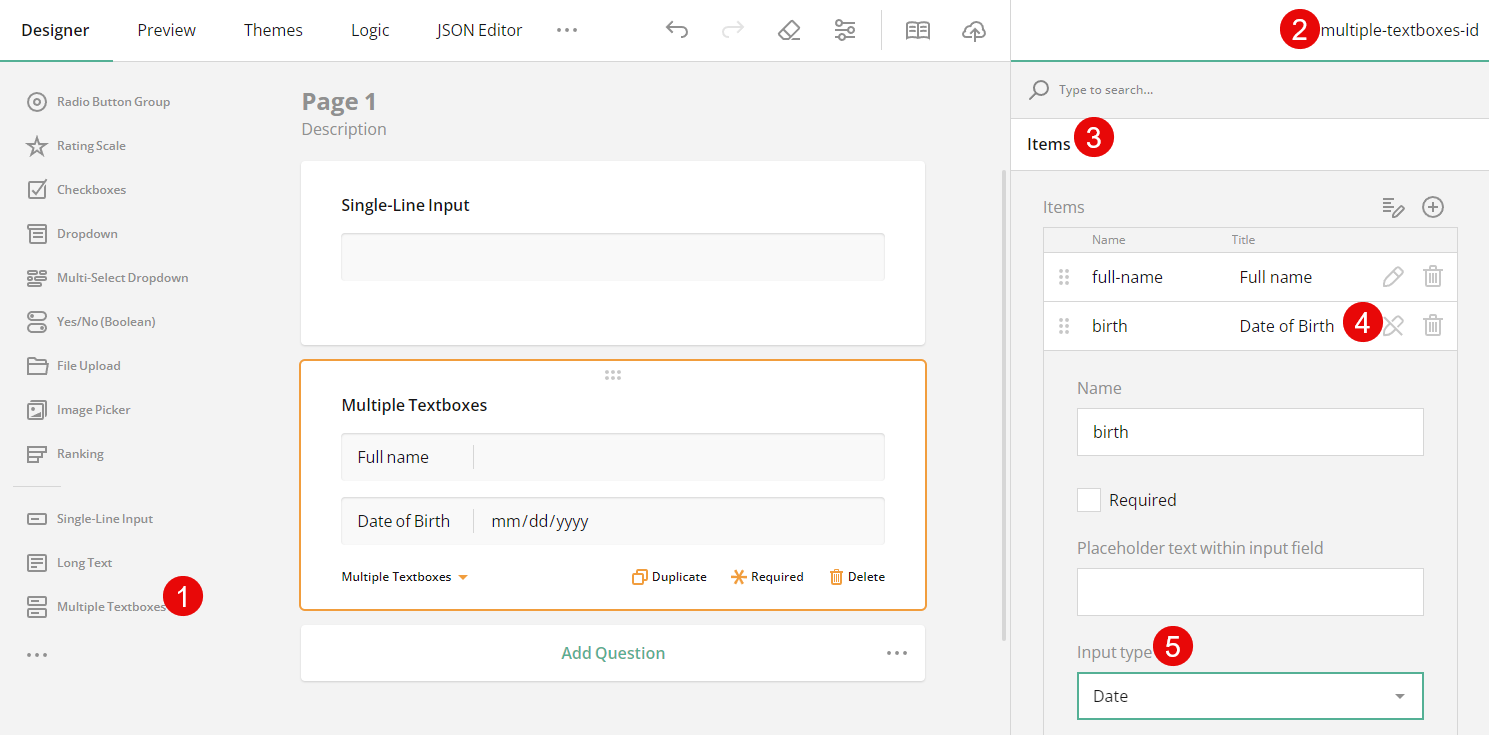
By default, a Multiple Textboxes question consists of two single-line fields whose input types are set to Text. To change the input type of an individual single-line field in a Multiple Textboxes question, follow these steps:
- Select a Multiple Textboxes question. This action will display the question settings in the Property Grid.
- Under Items, locate the field for which you wish to set a new input type.
- Click the Pen icon on the right of the input field title to expand the field's settings.
- Locate the Input type property.
- In the drop-down menu, select among the available input types.
Multi-Select Matrix
The Multi-Select Matrix allows you to set cell types for all cells of a matrix table or for cells of a particular matrix column. By default, when a new Multi-Select Matrix is added to a form, all cells have the Dropdown type.
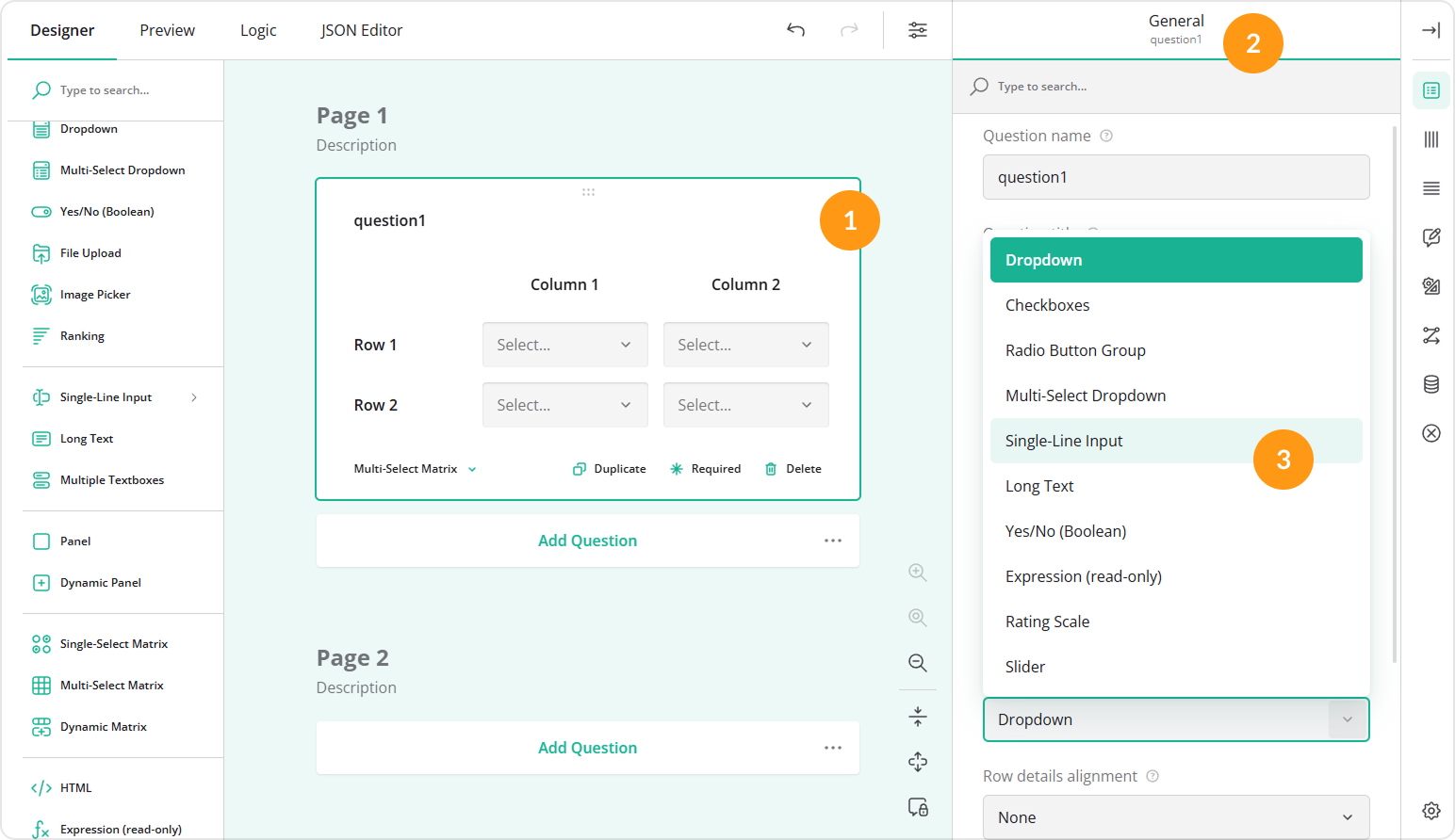
To change the cell type for all cells of a matrix table, follow these steps:
- Select a Multi-Select Matrix question. This action will display the question settings in the Property Grid.
- Under General, locate the Cell input type property.
- In the drop-down menu, select among the available cell types.
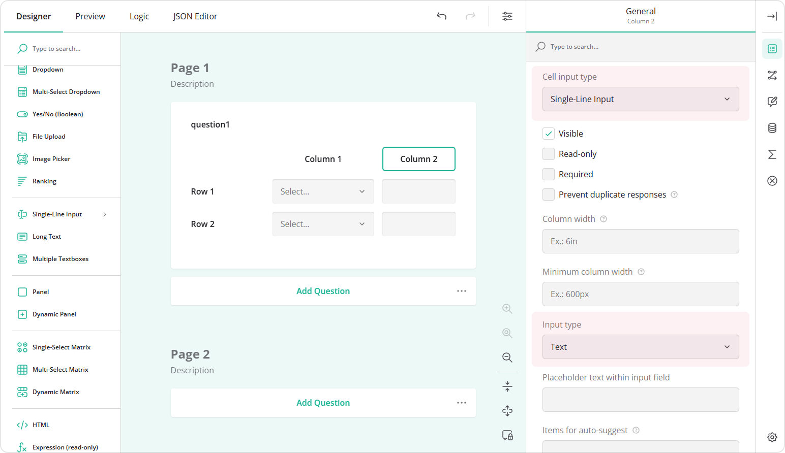
If you choose to set Cell input type to Single-Line Input, you can also specify input type for each column of such a matrix.
To set an input type for a column of cells within a Multi-Select Matrix, follow these steps:
Select a Multi-Select Matrix question. This action will display the question settings in the Property Grid.
Under Columns, select the column for whose cells you wish to set a new input type.
Click the Pen icon on the right of the column title. This action will display the column settings in the Property Grid.
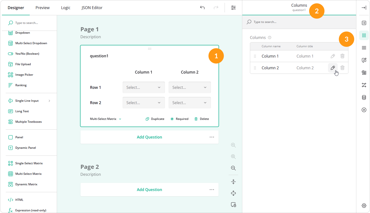
Another way to display the column settings in the Property Grid is by clicking the area around the column title on the design surface.
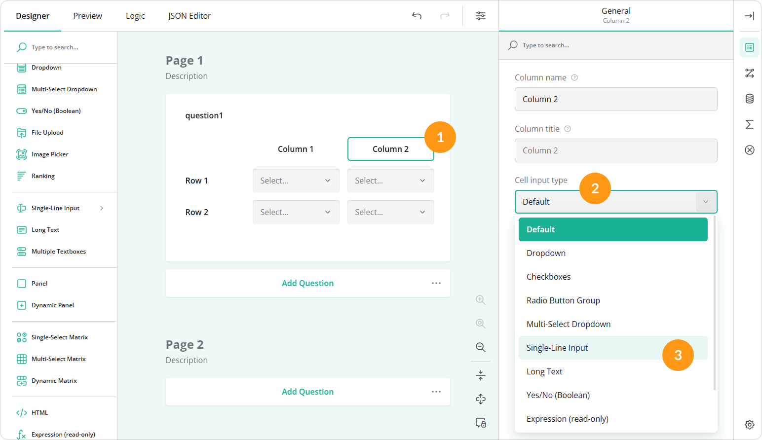
Under General, locate the Cell input type property. By default, it is set to Default, which means that it inherits the cell type set for the entire matrix table.
In the drop-down menu, select Single-Line Input.
Locate the Input type property.
In the drop-down menu, select among the available input types.
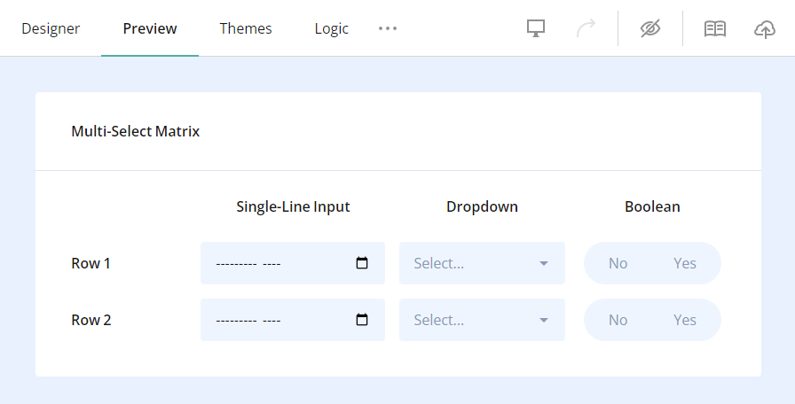
The image below illustrates a three-column matrix table with cell input types set to Single-Line Input, Dropdown and Yes/No (Boolean). The first column has its "Input type" property set to Month.
A cell input type set for a column overrides the same setting defined for all cells within a multi-select matrix table.
To set input types for column cells within a Dynamic Matrix, follow the same instructions as for the Multi-Select Matrix.
Send feedback to the SurveyJS team
Need help? Visit our support page