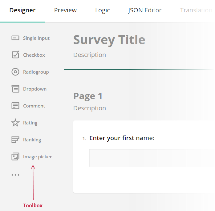
Toolbox Customization
The Toolbox contains available question and panel types. Users can click questions and panels or drag and drop them onto the design surface to add them to the survey. This help topic describes how you can customize the Toolbox.
- Full and Compact Modes
- Limit Available Question and Panel Types
- Group Toolbox Items by Categories
- Customize Predefined Toolbox Items
- Add a Custom Toolbox Item
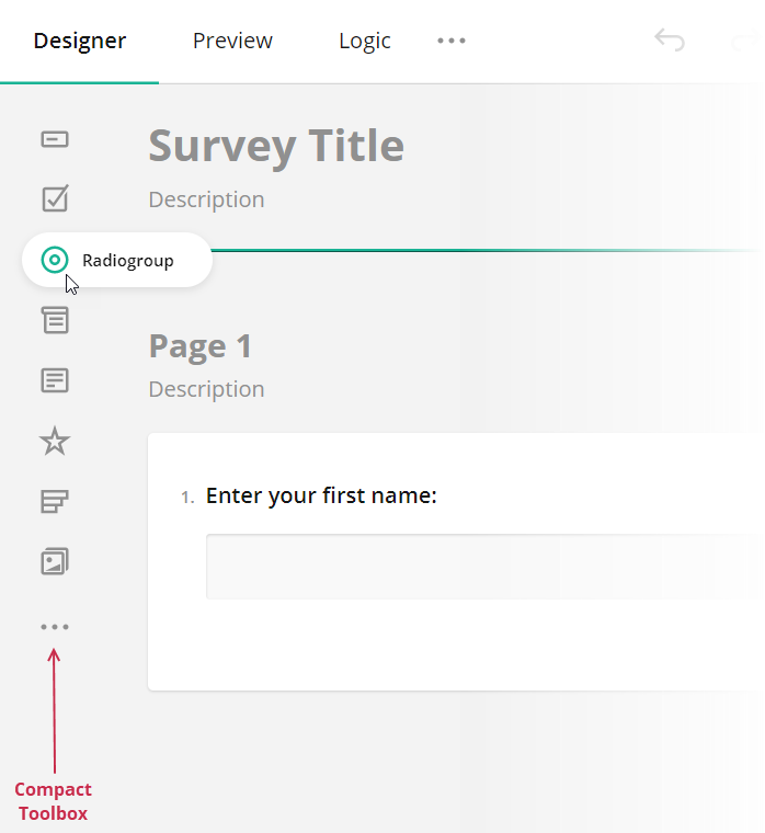
Full and Compact Modes
The Toolbox supports full mode (illustrated above) and compact mode. In compact mode, element names are hidden. To see an individual element name, a user should move the mouse pointer over the element icon.
The Toolbox switches between the modes automatically based on available width. Specify the forceCompact property if you want the Toolbox to always use a specific mode:
// Compact mode
creator.toolbox.forceCompact = true;
// Full mode
creator.toolbox.forceCompact = false;
You can also use the isCompact property to find out whether the Toolbox is currently in compact mode:
console.log(creator.toolbox.isCompact);
Limit Available Question and Panel Types
All available question and panel types are listed in the getType() method description. If you need to show only a part of these types, specify them in the Survey Creator's questionTypes array:
const creatorOptions = {
    questionTypes: ["text", "checkbox", "radiogroup", "dropdown"]
};

const creator = new SurveyCreator.SurveyCreator(creatorOptions);

// In Vue and modular applications:
import { SurveyCreator } from "survey-creator-knockout";
const creator = new SurveyCreator(creatorOptions);
// In React:
import { SurveyCreator } from "survey-creator-react";
const creator = new SurveyCreator(creatorOptions);
// In Angular:
import { SurveyCreatorModel } from "survey-creator-core";
const creator = new SurveyCreatorModel(creatorOptions);
Group Toolbox Items by Categories
The compact Toolbox does not display categories.
To group Toolbox items, call the changeCategories() method. It accepts an array of objects with the following fields:
name
The name of the item that should be grouped. Refer to thegetType()method description for a list of accepted values.category
A category for this item.
The following code places the Panel and Panel Dynamic types into the Panels category and the Matrix, Matrix Dropdown, and Matrix Dynamic types into the Matrixes category:
creator.toolbox.changeCategories([
    { name: "panel", category: "Panels" },
    { name: "paneldynamic", category: "Panels" },
    { name: "matrix", category: "Matrixes" },
    { name: "matrixdropdown", category: "Matrixes" },
    { name: "matrixdynamic", category: "Matrixes" }
]);
Ungrouped items fall into the General category. You can use localization capabilities to change its caption. If your application does not employ modules, use the following code:
<script src="https://unpkg.com/survey-creator-core/survey-creator-core.i18n.min.js"></script>
const translations = SurveyCreator.localization.getLocale("");
translations.ed.toolboxGeneralCategory = "Common";
In modular applications, use the code below:
import "survey-creator-core/survey-creator-core.i18n";
import { localization } from "survey-creator-core";
const translations = localization.getLocale("");
translations.ed.toolboxGeneralCategory = "Common";
The following properties control the behavior of categories:
allowExpandMultipleCategories
Allows more than one category to be in an expanded state. If this property isfalse, when a user expands a category, other categories collapse.keepAllCategoriesExpanded
Expands all categories. Users cannot collapse them.
creator.toolbox.allowExpandMultipleCategories = true;
creator.toolbox.keepAllCategoriesExpanded = false;
Customize Predefined Toolbox Items
To customize a predefined Toolbox item, pass its type as an argument to the getItemByName(itemName) method. This method returns the item's configuration object. Change the properties of this object to customize the Toolbox item. For example, the following code uses the json property to override predefined choices for a Dropdown question:
creator.toolbox
  .getItemByName("dropdown")
  .json
  .choices = [
    { text: "Option 1", value: 1 },
    { text: "Option 2", value: 2 },
    { text: "Option 3", value: 3 }
  ];
Add a Custom Toolbox Item
Since the Toolbox is meant to contain question and panel types, to add a new element, you need to create a custom question or panel type. Refer to the following help topics for detailed instructions: